Tuesday, May 29, 2012

Lab #7: Census 2000/2010


The Black (alone) population percentage by county is highest in Southeastern areas of the United States. The percentage ranges from 0% to as much as 86% in populated counties. The data shows that the concentration happens in a historical context. In light of the migration of African people and the influx of slavery during the Jim Crow era, the Southeastern regions, mainly states such as Alabama, Georgia, and South Carolina. The possible reason for why these areas remain largely populated by the Black population is that there has been less migration between states.

According to the Census, the Asian population makes up approximately 5% of the United States population. The percentage ranges from 0% to 46%. This census data shows the areas where the concentration of Asians (alone) is high. From this GIS map, I can infer that Asians are concentrated in major states such as California, New York, and Washington. One must ask why this concentration happens in these particular areas. Through examining the historical presence of Asians in America, these areas have been major ports for major Asian migration into the United States. From Angel Island to creation of Chinatowns across the nations, these areas have become a hub for Asians to seek aid, services, and be with people they feel comfortable around.
 
The Other Race Alone percentage is highest in the Southwestern regions of the United States.  The Other Races population map shows the race that is not labeled as "White", "Black or African American", "American Indian and Alaska Native", "Asian" and "Native Hawaiian and Other Pacific Islander." The percentage ranges from 0% to 39%. The majority of this population can be referenced to as Hispanics. The Southwestern regions are closest to the borders and easily accessible for recent migrants.

This GIS lab allowed me to utilize data from the census. This is a great tool to map out numbers, percentages, and other data references for analysis. I developed a better understanding of manipulating the legend values and coloring the map to represent levels of concentration. Through this exercise with working with Census data, I can see the dispersion of different races and the analyze them to see the connection with historical contexts.


Tuesday, May 15, 2012

Lab #6: DEMs in ArcGIS


Lying between the Los Angeles Basin and the Mojave Desert, the San Gabriel Mountains is a unique area to examine. It can also be noted that the main road that passes through these mountains is the Angeles Crest Highway. The highest elevation point is approximately 3068.02 miles. The lowest elevation point is approximately 61.5424 miles. The spatial reference used is GCS_North_American_1983. The extent of the information (decimal degrees) of source NED_00192385 are Top: 34.5811111102 degrees, Left: -118.38388889 degrees, Right: -117.482222223 degrees, Bottom: 34.0930555546 degrees.

Lab #5: Projections in ArcGIS


Planar Distances from Washington, D.C. and Kabul, Afghanistan via Conformal, Equal Area, and Equidistant Map Projections


Map projection is a tool in which the 3D world can be represented in the 2D form. This approach allows geographers, urban planners, architects, and other entities to analyze data in simpler terms instead of mentally figuring the 3D world. There are many different projections that can be done. The main three that we focus on are: conformal projections, equal projections, and equidistant projections. These different projections represent different data and analysis. In this lab, I analyze the planar distance from Washington, D.C. and Kabul, Afghanistan via Conformal, Equal Area, and Equidistant Map Projections. Also, with these different map projections come pitfalls and difficulties.

Conformal map projections preserve angles. This distorts the area and distance on the map. Gall’s Stereographic map projection shows that distortion slowly increases away from these latitudes. For the stereographic map projection, scales are distorted as we move away from the center and area is distorted as distance increases. The pitfalls for this particular map projection may be in the size of each country/region. Although the angle is preserved, the shape and area is further distorted, giving off an image that confuses people. One can assume that these map projections allow political parties propagandize; for example, the image of Russia as being bigger than it actually is. Another example would be Greenland’s distorted size and shape.

Equal area map projections focus on preserving the area. The angle, shape, and distance are distorted as you move from the equators and closer to the poles. These map projections are generally used for world maps and are good for regions close to the equators due to the lack of distortion there. The positive aspect of these map projections is that Greenland is not blown out of proportion in terms of shape and area.

Equidistant map projections focus on preserving the distance from certain reference points. Choosing different reference point(s) can distort the map. The Equidistant Cylindrical map projection is best used for small areas with map scales, such as city maps. It is used to simply represent minimal geographic data, making for easy index maps. The Equidistant Conic map projection is common for atlas maps of small countries. It was used in the Soviet Union to map out their territory. Equidistant map projections then are limited in the sense that particularly everything is distorted in one way or another, for example the limitation of the angles.

Tuesday, May 8, 2012

Lab #4: Introducing ArcMap

ArcGIS Map Poster:

Before I began using ArcGIS, I scanned the room to see if other had opened up their instructions. The first thing I did was acknowledging how many pages the tutorial was. With over 50 pages, I started to think that I would not be able to finish this lab due to my time constraints with other responsibilities. The directions were of course detailed, but tedious at the same time. Working with ArcMap offers an array of advantageous possibilities and potential pitfalls.

ArcGIS allows urban/city planners, geographers, political scientists, architects, and others to map out any desired dataset. Lines, polygons, points, and different drawing tools can interpret data. Color-coding, bar graphs, line graphs, and different mechanisms make the datasets easier to comprehend. Although neogeography mapping allows for people create their own maps, ArcMap and ArcGIS allow users to create more detailed and comprehensive data and analysis, such as adding layers and using extent rectangles to efficiently map out their datasets.

One critique I had about the program was the amount of space of error. One mistake could potentially ruin the project that you start. Saving and editing project was among the tedious tasks. In order to proceed in the lab, you had to export every separate project as a .jpg file and upload it into the larger frame. Saving his file in a .jpg means that you will not be able to edit it later on. You would have to make sure that you have the data set on your file and .jpg to open and edit a file successfully. If users forget to save the file in the correct setting, then the project will take more time than needed.

Being non-tech savvy, it was hard for me to work with a computer program. Though, I definitely find that this tool is useful for urban planners like myself. In the future, I hope to see that ArcGIS becomes a more accessible tool for everyone and also refines its complicatedness. I plan to reuse this program for future planning ideas. This visualization process allows for fast and detailed analysis of any dataset.


Tuesday, April 17, 2012

Map of Historical and Influencial Protests in Los Angeles


View Places of Protests in LA in a larger map

Neogeography allows people to create and manipulate maps. While using this neogeographical tool, I notice that there may be limitations and consequences to neogeography. Combining different geographic mapping tools, anyone can create a map that suits them. It is a great way for people to interact with maps.
Neogeography is highly dependent of the original maps. Maps can become outdated and the accuracy might not be certain. Streets, buildings, and geographic landmarks have changed. For example, Google Earth might run into problems because the data they use are dated a few years ago. As a public tool, anyone can create neogeographic maps of their choice. This potentially creates a misleading documentation of places. People can create their own maps, which might show false and incorrect information.
As Los Angeles’ demographics and urban structures change over periods of time, it begins to decentralize. In this decentralization of Los Angeles, there becomes no central place to gather and protest. Unlike metropolitan areas like New York and San Francisco, Los Angeles has a lack of places to mobilize and get together. We should ask ourselves why people would want to protest in the first place. The history of Los Angeles possesses many inequalities of public uses of space. Protests have long been a way in which disenfranchised and voiceless people can get across what they believe in. In doing so, protests become either structured or unstructured, with different goals. These many goals can be connected to understanding the conditions of the demonstrators at the specific time/period.
In examining different protest situations and sites, such as Pershing Square, the Rodney King incident, Florence & Normandie, Justice for Janitors at USC and Olympic Boulevard in Century City, we can see the connection between inequality and space. This stems from the change in demographics—for example, with increasing immigrant populations and the labor force. Sparking the Rodney King incident is the many social inequalities happening around that time. The Florence & Normandie incident was an event that followed the Rodney King incident; it relates to the anger from injustices and inequality. The USC and Olympic Boulevard in Century City Justice for Janitor events originated in response to the inequality within the workplace. Pershing Square reminds us that people come together to bring about a cause; as one of the first and last open/public places of protest in Los Angeles, it has served as a hub for the fight about inequality in the workplace, politics, and much more. Los Angeles has become a city where there is no central location to protest, thus providing a mobile network of places of protest.
There is also a change in unionizing, with the changing demographics of increasing immigrant workforce populations. In understanding that Los Angeles has no central place to protest, we can come to a conclusion that this is related to the influences in the many different protests. Even though there is changing demographics, there is a common trend in media and police reaction. Due to the fact that there are no central locations, protests become harder to manage and where to find them becomes a burden to demonstrators trying to rally as well. The media and the police both become nodes of reaction.

Sunday, April 15, 2012

Lab 2

Randy Mai

UID: 203689788

April 10, 2012

Geography 7

LAB 2

1. What is the name of the quadrangle?

Beverly Hills Quadrangle

2. What are the names of the adjacent quadrangles?

Canoga Park, Van Nuys, Burbank, Topanga, Hollywood, Venice, & Inglewood

3. What was the quadrangle first created?

1995

4. What datum was used to create your map?

North American Datum of 1927 (NAD 27), North American Datum of 1983 (NAD 83), & National Geodetic Vertical Datum of 1929

5. What is the scale of the map?

1: 24,000

6. At the above scale, answer the following:

a. 5 centimeters on the map is equivalent to how many meters on the ground?

5 cm on map = 1200 m on ground

b. 5 inches on the map is equivalent to how many miles on the ground?

5 inches on map = ~1.894 miles on ground

c. One mile on the ground is equivalent to how many inches on the map?

1 mile ground= ~2.64 inches on the map

d. Three kilometers on the ground is equivalent to how many centimeters on the map?

3 km on ground = 12.5 cm on map

7. What is the contour interval on your map?

20 feet

8. What are the approximate geographic coordinates in both degrees/minutes/seconds and decimal degrees of:

a. The Public Affairs Building

Latitude: 34°4’22”

Longitude: 118°26’15”

b. The tip of Santa Monica Pier

Latitude: 34°0’8”

Longitude: 118°30’

c. The Upper Franklin Canyon Reservoir

Latitude: 34°6’15”

Longitude: 118°24’41”

9. What is the approximate elevation in both feet and meters of:

a. Greystone Mansion (in Greystone Park)

560 ft or 170. 688 mi elevation

b. Woodlawn Cemetery

140 ft or 42.672 mi elevation

c. Crestwood Hills Park

780 ft or 237.744 mi elevation

10. What is the UTM zone of the map?

Zone 11

11. What are the UTM coordinates for the lower left corner of your map?

UTM northing: 3763000m N.

UTM easting: 361000m E.

12.How many square meters are contained within each cell (square) of the UTM gridlines?

1000 m2 contained within each cell

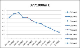
13.Obtain elevation measurements, from west to east along the UTM northing 3771000, where the eastings of the UTM grid intersect the northing. Create an elevation profile using these measurements in Excel (hint: create a line chart). Figure out how to label the elevation values to the two measurements on campus. Insert your elevation profile as a graphic in your blog.


1. What is the magnetic declination of the map?

14° East

2. In which direction does water flow in the intermittent stream between the 405 freeway and Stone Canyon Reservoir?

From north to south

3. Crop out (i.e., cut out and paste) UCLA from the map and include it as a graphic on your blog.